
- Extreme and very deliberative finish to the point of the whole surface being faultless and robotic
- An unnatural varnish like sheen over the surface that seemed to belie almost a machine-imparted inkjet quality to the finish (think how a laminated color printout would look)
- Not one brushstroke out of place, not even a errant stray mark of an offending brush-hair
- A manga or anime comic book ‘feel’ to the effect where all paint boundaries are filled in perfectly with complementary colors
- A prevalence to using enamel or latex on aluminum or wood panel
I could go on and on, but some of these pieces are being exhibited right now at some of our high end galleries seem a bit pointless in all of their glorified abstraction. In fact the technique used to develop these surfaces seem so laborious (seemingly) that once (I am guessing) the artist perfects the same, the process invested is so great that they would rather not look at any change of style or substance. This results in all of the paintings at these galleries looking like carbon copies with minor variations on the major theme. I have a few pictures of these paintings from my visits and I hope they shed some more light. Of course, the ink-jet-printer-faux-finish can only be appreciated (or denigrated) on a closer physical visual inspection of these pieces (some of which sell are purported in the tens of thousands of dollars – good for the artists though). I must add that they are a treat to the eyes visually...
Yes, if all was right, I would have bought one of these pieces, and hung it up not as a painting, but as effective decoration behind the faux leather couch in our basement...
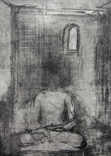
Emilio Perez at Galerie Lelong, Acrylic and latex on panel


Ingrid Calame at James Cohan Gallery, Enamel Paint on Aluminum


Aaron Noble at Pavel Zoubok gallery, Acrylic on canvas


4 comments:
I am beginning to call it the juxtapoz effect, everyone is doing a variation of a theme. Not denigrating the mag,I love Juxtapoz magazine but there is a style (as wonderful as it is) that has become de rigueur.
ps. did you send me an email? I just think I accidentally deleted it :(
If you did can you resend.
Great blog entry.
Corrine,
Thanks. I will resend that email. Yes, I did send it across. In fact just yesterday I was at a nanotechnology symposium here at our firm and the possibilities are endless. We had invited speakers from MIT and Albany… Yes, I would love to read the published work of your husband.
Regarding this post - yes, sadly so - there are broad common themes, genres that seem to be 'in' and everything else slightly on the outside. What is interesting is that all of the galleries mentioned are very high end - and this is what must be commanding the highest prices out there...
Also, don’t' get me wrong, the artists are putting a lot of work into creating pieces like these and they should be rewarded, but stuff like this tends to get a tad boring after the fad has passed - just like fashion...
I was thinking the same thing, Sunil! And how odd, the word "haywain" popped into my head yesterday and I thought of the Constable painting. Cue Twilight Zone music ;-)
I just wish artists would get over the adolescent/comic bok doodling. I know I want to see something different.
Kimberly,
Yes, it is about time that artists went beyond the ‘comic book doodling’ (liked your phrase there), but it seems to sell well in Chelsea these days and I guess the bottom line is what matters to a lot...
Sometimes it was the artificiality of the whole thing that got to me...
Post a Comment